|
Take a look at the first box in your
output file called Correlations. You will see your variable names in two
rows. In this example, you can see the variable name ‘water’ in the first
row and the variable name ‘skin’ in the second row. You will also see your
two variable names in two columns. See the variable names ‘water’ and ‘skin’
in the columns on the right? You will see four boxes on the right hand side.
These boxes will all contain numbers that represent variable crossings. For
example, the top box on the right represents the crossing between the
‘water’ variable and the ‘skin’ variable. The bottom box on the left also
happens to represent this crossing. These are the two boxes that we are
interested in. They will have the same information so we really only need to
read from one. In these boxes, you will see a value for Pearson’s r, a Sig.
(2-tailed) value and a number (N) value.
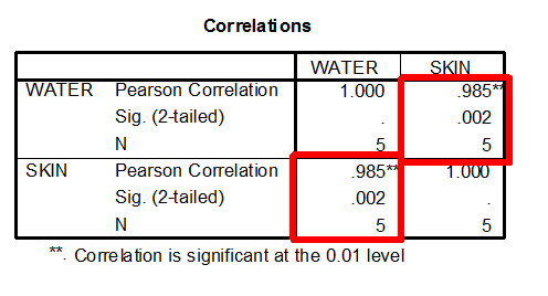
You can find the Pearson’s r
statistic in the top of each box. The Pearson’s r for the correlation
between the water and skin variables in our example is 0.985.

This means that there is a strong
relationship between your two variables. This means that changes in one
variable are strongly correlated with changes in the second variable. In our
example, Pearson’s r is 0.985. This number is very close to 1. For this
reason, we can conclude that there is a strong relationship between our
water and skin variables. However, we cannot make any other conclusions
about this relationship, based on this number.
This means that there is a weak
relationship between your two variables. This means that changes in one
variable are not correlated with changes in the second variable. If our
Pearson’s r were 0.01, we could conclude that our variables were not
strongly correlated.
This means that as one variable
increases in value, the second variable also increase in value. Similarly,
as one variable decreases in value, the second variable also decreases in
value. This is called a positive correlation. In our example, our Pearson’s
r value of 0.985 was positive. We know this value is positive because SPSS
did not put a negative sign in front of it. So, positive is the default.
Since our example Pearson’s r is positive, we can conclude that when the
amount of water increases (our first variable), the participant skin
elasticity rating (our second variable) also increases.
This means that as one variable
increases in value, the second variable decreases in value. This is called a
negative correlation. In our example, our Pearson’s r value of 0.985 was
positive. But what if SPSS generated a Pearson’s r value of -0.985? If SPSS
generated a negative Pearson’s r value, we could conclude that when the
amount of water increases (our first variable), the participant skin
elasticity rating (our second variable) decreases.
You can find this value in the
Correlations box. This value will tell you if there is a statistically
significant correlation between your two variables. In our example, our Sig.
(2-tailed) value is 0.002.

You can conclude that there is no
statistically significant correlation between your two variables. That
means, increases or decreases in one variable do not significantly relate to
increases or decreases in your second variable.
If the Sig (2-Tailed) value
is less than or equal to .05…
You can conclude that there is a
statistically significant correlations between your two variables. That
means, increases or decreases in one variable do significantly relate to
increases or decreases in your second variable.
The Sig. (2-Tailed) value in our
example is 0.002. This value is less than .05. Because of this, we can
conclude that there is a statistically significant correlation between
amount of water consumed in glasses and
participant rating of skin elasticity.
When you are computing Pearson’s r,
significance is a messy topic. When you have small samples, for example only
a few participants, moderate correlations may misleadingly not reach
significance. When you have large samples, for example many participants,
small correlations may misleadingly turn out to be significant. Some
researchers think that significance should be reported but perhaps should
receive less focus when it comes to Pearson’s r.
You can find your scatterplot in
your output file. It will look something like the graph below. You will see
a bunch of dots. Your scatterplot can tell you about the relationship
between variables, just like Pearson’s r. With it, you can determine the
strength and direction of the relationship between variables.
Try to imagine a line that connects
the dots in your scatterplot. Is this an easy or difficult task? This task
can help you determine the strength of the relationship between your two
variables. If your variables have a strong relationship, it will be easy for
your to imagine a line connecting all of the dots. For example, in our
example scatterplots, the dots seem to go together to form a straight line.
However, some scatterplots do not look like this. With some scatterplots,
the dots are scattered about so that it is very hard to imagine a line
connecting them. The dots are not densely positioned in one place. Instead,
they are all over the place. When this is the case, your variables may not
have a strong relationship.
You can use your scatterplot to
understand the direction of your relationship. Your scatterplot can tell you
if you have a positive, negative or zero correlation.
If the line that you imagine in your
graph slopes upward from zero, you can conclude that you have a positive
correlation between your variables. Increases in one variable are correlated
with increases in your other variable. Similarly, decreases in one variable
are correlated with decreases in your other variable.
If the line that you imagine in your
graph starts high at zero and gradually slopes downward, you can conclude
that you have a negative correlation between your variables. Increases in
one variable are correlated with decreases in your other variable.
If the line that you imagine does
not slop, or you can’t imagine a line at all, you can conclude that you have
a zero correlation between your variables. That means that your variables
are not related to one another. Increases or decreases in one variable have
no effect on increases or decreases in your second variable.
|
